
Verbose Issue 2
2022
GRAPHIC DESIGN
Similar to experimentation, I decided to keep Verbose going and experiment more with how I could design it and the changes I could incoperate using various game assests and information to take a more creative approach to design (compared to the first issue)
As I've mentioned above the primary focus for this issue of Verbose was to be creative and go out of the box for the designs of each page. Previously I took a very professional approach to page design keeping a consistent theme for single pages and taking on the themes of the games we were disscussing for the double page spreads. However an idea occured to me "what if all pages had the effort of the double spreads making each page unique and tailored to the games they covered?". Because I wanted to achieve this I stepped away from focusing on the writing to be professional and instead took to focusing on the design aspect ; this sometimes involved spur of the moment designs and meticulously planned out designs.
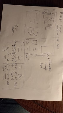
One area I didn't neglect was planning as this helped to organise the work I would do as well as give me a basic outline of the writing for each page. To the left and right you'll see the page plans that outlines exactly what's written on each page; I would often go back and edit over this to make sure things were consistent. Then just below that isa basic plan outlining all the topics/games I've covered as well their pages alongside the last few pages of writing.

For this page on Mystic Warrirors the focus was using Character and Stage assests from the games. my main issue was how to incoperate them. Originally I had the idea of using the backgrounds around the top and bottom and creating a stage similar to that of in game. However, this would destroy a lot of writing space so I opted for a less destructive version with the promotional art of the characters alongside stage backgrounds to fill in the gaps.
As I mentioned before I did some plannning for a few pages, mostly when I became stuck at various points. The first of these was at the very first single page, I wasn't 100% on how to approach it which led me to drawing up ideas. Alongside this I also had some trouble with a double spread and also planned out how to improve it through planning. You can see the single spreaad to the left and the double to the right.


As for where the resources to get the individual pieces of each item for most articles I looked to the Spriters resource, this is a website that acts as a database for any game rips (neww and old) so that the assests of different games are perserved for people to see and find; all are free for personal use but, not for commerical use - this fits my needs as I don't want to sell this work or anything it's simply experimentation. On the website you can search for specific games based on title, console or even the genre of games; in my case not all games I was writing about was on there so for some I needed to improvise and find other traditional methods to showcase the game.
As an example here is the page for Mystic warriors and the different sprite/backgrounds available to use
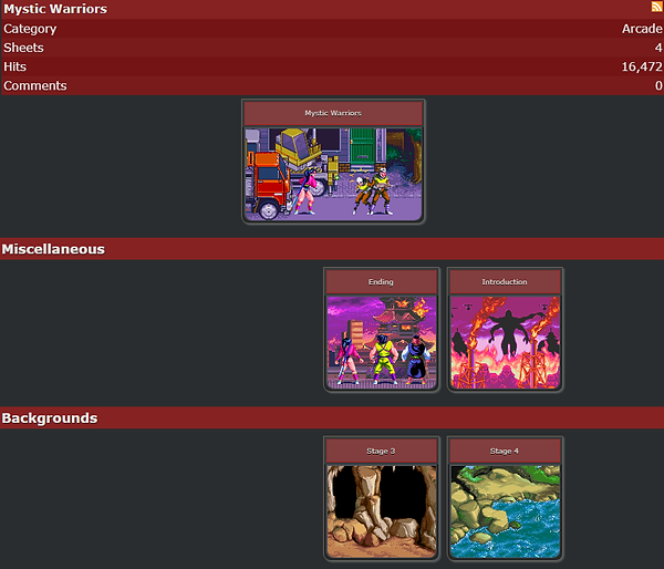
There isn't too much here which is actually quite understandable due to Mystic Warrirors being an Arcade game of old - the machines are hard to find as well as rip the data from. However, the items that were here fit my purposes and used different assests, such as the ending sprites jumping away on the contents magazine and Stage 4 for most of the backgrounds on the actual page.
Originally I had planned to focus the massive 'R4' made entirely up of Cars on one page, however I soon saw the benefit of going smaller and took a line of cars out to instead be the borders to the title; a choice well worth the effort in my opinion. Just below is what the originaly 'R4' title looks like on promotional art for the game.

Credit: Namco
I used these techniques to help me create different pages throughout the magazine and while not all of them were up to my expectations I was very happy with what I had made. Sadly I realised that the issue with doing things like this is that it can be more time consuming simply because choosing the design and planning stuff out for them can take longer than if you already have a set template and consistent design throuhgout the magazine. Despite this draw-back I throughly enjoyed this approach and took the challenge of trying to design for some games I knew well and for some I had never even heard of in the first place!
In conclusion, I think it was a resounding success at taking a stab in the dark with experimentation! I was happy with the majority of pages and would love to design like this again for a Verbose 4, I'm currently working on Verbose 3 and trying to mix in elements between the first two magazines of Professional consistency and Creative freedom; the reasoning here is to simply try all forms and experiment beyond what I know to find which style I enjoy the most as well as to reconginse the draw backs of each.
On that note, you can read through issue 2 of Verbose just to the right.
(As usual scroll up for the cover!)


Similar to the first issue I want to quickly discuss and go over the inspirations within this issue - all of which are tied to Retro gamer magazine. Retro gamer, as evident by the title, covers older games - its audience mostly relates to middle-aged men as well as perhaps a younger late 20s and perhaps even younger if the interest of older games strikes (such as with me). The interesting thing about Retro gamer that hooked me was their article design, more often than not takes the specific design of the games they write for, around you can see some examples - contents page for a 40th anniversry of Pac-Man, and double spreads focused on the specific games they're writing on. This was very interesting to me and really engaged me to enjoy the asthetics of the pages almost as if it were art itself - practically drawing me into the whole page and enticing me to read the articles! this full on designing that could vary and take on any kind of theme was very exciting to me and I wished to try my hand at it the moment I saw it! This was a heavy inspiration for the whole magazine and while I did my best to take the themes of each game I do feel that I can learn even more from this style and would like to design more around it. As mentioned before you can see some examples of the inspiration around this blob of text!


