
Milk and Tweed Work Exp
2022
GRAPHIC DESIGN
For this project it was actually done as some work experience for a company called Milk and Tweed who are a well-known design agency in the area. The focus was on trying to build a professional brand and to work through the inital design idea process.
The idea they wanted to see our class elaborate on was designing different logos for a restaurant/food chain of some kind, as well as make any mock-ups for uniforms or storefronts etc.
For my design I set my sights on a nautical/pirate theme of a rum bar focused on specialising in seafood and rum - calling it the Seven Seas originally. The first draft designs were Treasure like Yellow-Gold focused with a Muted Grey (almost black but, leans more on the brighter side of it) background.
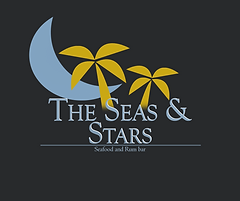
I tried to make three variations of drafts as instructed which you can see here. One focused on using Shark fin/Wave like shapes to fill in for letters, one was the name stretched into a turtle and finally, a small moon shaped island with tropical trees on the design.
I decided to put the Final design forward as my chosen design showcasing the others as development of ideas. I also went about making various mock-ups with this final design.
Upon receiving feedback, a mixed bag was presented - it needed more colours in the piece. So I went about adjusting the chosen piece in various ways - firstly I used white for the text to introduce a new colour in a non destructive way. I chose to only add one colour as I didn't want to over complicate or over saturate the design.
Secondly I adjusted the name to "Sea and Stars" to add more purpose to the design (which actually relates much better in the next paragraph)
Eventually I decided white was too simple and not exciting enough, so I did some research into combinations for yellow and gold colours - this led to me trying out the font in a light blue colour to also add imagery of oceans and waves. Lastly, to be 100% secure and attempt new things I decided to adjust the logo itself making the island part of the design blue and also transforming it into a moon! This actually works pleasantly well as it helps separate the seas and stars parts of the design.
In addition to the final design I also made sure to use it as a storefront mock-up adjusting some pieces to give a hypothetical look to the brand.
These final designs acted as my final submission. In conclusion, I believe I did the work to the best of my ability, it may not have been a total success and the results not to all likings but, It showed reflection, willingness to try and improve as well ability to act upon ideas.


.png)


Additionally we needed to present this to a representitve from the company at the midpoint (where I got feedback) as well as at the end of the project whiich you can see below - here I outlined what I changed and my reasoning behind it.
Finally, I feel like this project isn't a massive success - the design is nice but, perhaps not nice enough for most brands to make an impact, in that regard I tried to make something unique and work with it until the end and that's a skill that is worth having - especially when you can still salvage projects or scrape together something from the ashes of failure.


