top of page

Gameboy mag -Redesign task
2021
GRAPHIC DESIGN
This task was set during another task and was originally disguised as an extra task, after completion we were then asked to redesign and reattempt the work to teach the importance of being able to redesign as per client needs.

.png)
We were originally introduced this task being told to 'cover some issue important to you' in any form we wished - as I was wanting to work towards making a full length magazine for my final major project - I decided on a magazine (a short one with just one inside page due to time constraints - think of it as a proposal for a magazine instead of an incredibly short one).
I started off by gathering more research and information about a controversial issue Nintendo had made after a direct where they charged a decent amount of money for a larger subscription with not so many benefits available. Firstly I compiled a document of information covering what could be in the article as well as making a visual graphic to understand and compare the deals each platform currently offered.
Before going onto designing the cover for real I focused on developing different mock ups and plans for the cover and I initally tried to work with an image of the presenter of the nintendo direct, Yoshiaki Koizumi, in which I tried to manipulate to make it look more like a shrug than him holding controllers. Eventually I decided against this idea as it felt slightly unnatural and I didn't like presenting false information even in a visual format (although it was a nice idea). You can see the failed attempts and plans just below and to the left and right of here.

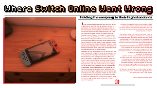
To the left here you can see the first iteration of the article and cover - below it is a pdf covering the creation of the article, the inpsiration and the processes that went into it
And for awhile this was the end of project.
Until a few weeks later we were asked to revist it. I did a quick mental evaluation of what I felt was good and what could be better. I knew I liked the cover yet it felt lacking in some areas - more specifically part of it felt too empty on the other hand, I did not like the article whatsoever I felti t was too bland and generic and could be a lot better than what I had originally came up with.
With these Ideas in mind I set about adding to the cover and making the article completely from scratch. This didn't take too long and simply was a matter of re-evaluating and thinking of what to adjust. For the cover I added in additional graphic and disguised it behind our presenter, Yoshiaki, while also adding a colour overlay and lowering the opacity. For the article I tried to do away with any preconceptual ideas and went in using graphics already on hand - essentially making the old cover part of the article. You can see the exact proccess to the right and the final work just below this block of text.

.png)
Overall, this work taught me the importance of revisiting and reviewing your techniques and finding ways to improve regardless of how small and insignicant they seem - improvement is always worth it. I don't think it's a blistering success simply because I see ways in which the project could be improved yet still - such as article refinement and perhaps more varied usage of graphics but, it helped establish the very idea of coming and revisting work to find your weaknesses awhile after you haven't seen it - in the moment you can't always see the glaring issues unless pointed out to you more often than not, so being able to realise that if you come back with a fresh mind and fresher eyes you can see things differently.
bottom of page